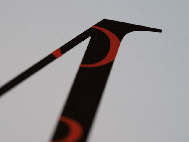
Typography is one of the most powerful tools in graphic design. Fonts do more than display text; they shape perception, create mood, and guide readers through content. Selecting the right type can elevate a design, while poor choices can undermine even the strongest visuals.
Why Typography Matters
Typography blends function and style. Fonts need to be legible, but they also communicate brand personality and emotional tone. The difference between a sleek sans-serif and a traditional serif is more than aesthetic, it changes how an audience interprets the message.
Typography as Visual Language
Fonts act like a visual accent. They carry personality, from playful scripts that feel informal to sharp geometric sans-serifs that suggest precision. Every font selection sends a message before the words are even read.
The Basics of Font Categories
To make informed choices, it helps to understand the primary font categories and their traditional roles in design.
Serif Fonts
Serifs are the small strokes attached to letters, often seen in newspapers and books. They suggest tradition, reliability, and authority. Brands in law, publishing, and finance often lean toward serif typefaces for their sense of trustworthiness.
Sans-Serif Fonts
Sans-serif fonts skip decorative strokes, offering clean lines and a modern feel. They are widely used in digital design because of their clarity on screens. Tech companies and startups favor sans-serifs to project innovation and simplicity.
Script and Decorative Fonts
Scripts mimic handwriting, bringing elegance or playfulness, depending on the style. Decorative fonts are more experimental, useful for headlines but rarely for body text. Overuse of these fonts can compromise readability.
Hierarchy and Readability
Beyond font style, typography must organize information effectively. This is where hierarchy and readability become essential.
Creating Visual Hierarchy
Designers establish hierarchy by varying font size, weight, and spacing. Headlines may be bold and large, subheadings slightly smaller, and body text clean and consistent. This natural flow directs the reader through the content without confusion.
Balancing Style with Function
A font may look attractive but fail in usability. Readability should always outweigh style for body text. Overly ornate fonts can tire the reader quickly, while excessively thin fonts may disappear on smaller screens.
Pairing Fonts Successfully
Most designs use more than one typeface, but pairing fonts requires careful thought. Poor pairings can feel chaotic, while thoughtful ones bring cohesion.
Contrast and Compatibility
Font pairing works best when there is contrast but not conflict. A serif headline combined with a sans-serif body creates balance. Avoid pairing fonts that are too similar, as they can look mismatched rather than complementary.
Practical Pairing Examples
- Serif with sans-serif for balance in editorial design
- Script with clean sans-serif for creative branding
- Bold display font with minimal sans-serif for posters
By mixing fonts wisely, designers achieve both harmony and distinction.
The Role of Spacing
Typography isn’t only about the shapes of letters. Spacing – leading, kerning, and tracking, affects how text feels and reads.
Leading, Kerning, and Tracking
- Leading refers to line spacing. Too tight, and text feels cramped; too wide, and it looks disconnected.
- Kerning adjusts space between individual letters, improving flow and balance.
- Tracking controls overall spacing across words, influencing density and readability.
Attention to these details separates polished typography from amateur work.
Typography Across Mediums
The best font for a printed book may not suit a website. Typography must adapt to the medium.
Print Typography
Print allows for high-resolution fonts and intricate details. Serif fonts are often favored in books for their readability over long passages. In posters or packaging, bold display fonts can capture attention at a glance.
Digital Typography
On screens, clarity is king. Sans-serif fonts dominate digital interfaces because they scale well and remain legible at small sizes. Responsive design requires typography that adapts to various devices without losing readability.
Quick Tips for Choosing Fonts
Here’s a simple set of principles to guide font selection:
- Prioritize readability, especially for body text
- Limit designs to two or three typefaces
- Use contrast to create hierarchy
- Match fonts to brand identity and tone
- Test readability on different devices and mediums
Bringing It All Together
Typography is both an art and a science. It demands sensitivity to style, readability, and context. A well-chosen font combination doesn’t just look appealing; it amplifies the message, making design stronger and more persuasive.
Fonts shape perception in subtle but powerful ways. By mastering typography, designers give their words more than form – they give them voice.