Graphic design evolves constantly, shaped by new technologies, trends, and tools. Yet beneath the changing surface, certain principles remain steady. These fundamentals form the foundation of effective communication through visuals. Whether creating branding, digital graphics, or printed materials, knowing these timeless rules helps designers craft work that feels both professional and meaningful.
Why Design Principles Matter
At its core, design is problem-solving. A graphic artist isn’t just arranging shapes and colors for beauty but guiding the viewer’s eye, evoking emotion, and delivering information. Principles act as a compass, ensuring that creativity doesn’t lose direction. They provide structure without stifling innovation, allowing each project to balance form and function.
Balance and Alignment
A successful layout feels stable. Balance doesn’t mean making every element identical; it means distributing visual weight so nothing feels lopsided. Symmetrical balance offers a calm, formal tone, while asymmetry creates movement and energy. Alignment reinforces this order by ensuring text, images, and shapes feel connected instead of scattered.
When designing a poster, for example, placing a large block of text on one side can be offset with a striking image on the other. This interplay guides the eye without overwhelming it.
Contrast and Emphasis
Contrast grabs attention. Differences in color, size, or style create visual interest and direct the viewer to what matters most. Without contrast, even the most beautiful design risks blending into the background. Emphasis is the act of using contrast deliberately, deciding where the eye should land first.
Creating Visual Hierarchy
Strong contrast helps form hierarchy. A bold headline, medium-sized subheading, and smaller body text lead the reader naturally through content. This hierarchy ensures clarity and flow.
Proximity and White Space
Proximity organizes. Grouping related elements together makes information easier to digest. White space, often misunderstood as wasted space, gives designs breathing room. It separates unrelated items, adds elegance, and prevents clutter.
For instance, a crowded flyer may contain all the necessary details but risks losing the reader’s attention. Strategic use of white space highlights what matters most.
Repetition and Consistency
Repetition builds recognition. Consistent use of colors, fonts, and shapes creates unity across a design or even across an entire brand. Without repetition, designs may look random, leaving the audience confused.
Why Consistency Builds Trust
Think of brand guidelines. When a company applies the same style across ads, websites, and packaging, it creates familiarity. Familiarity builds trust, and trust keeps an audience loyal. For example, Apple’s clean, minimalist design is instantly recognizable across its products, stores, and marketing, reinforcing a strong, trustworthy brand identity.
Typography as Design
Typography is more than choosing pretty fonts. Letterforms themselves carry emotion, serif fonts convey tradition, sans-serif feels modern, and script fonts suggest elegance or playfulness. Pairing fonts wisely prevents visual noise and strengthens the message.
Common Typography Mistakes
- Using too many typefaces
- Choosing decorative fonts for long paragraphs
- Ignoring readability across devices
By respecting these rules, typography becomes a design tool rather than a distraction.
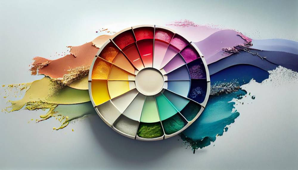
Color Theory and Emotion
Colors influence mood. Red can signal urgency, blue feels calming, and green suggests growth. Beyond psychology, color harmony ensures that chosen hues work together instead of clashing. Complementary or analogous schemes help maintain visual cohesion.
Accessibility in Color
Designers should also consider colorblind users. High-contrast palettes and thoughtful pairings guarantee readability for everyone. Organizations like the Web Content Accessibility Guidelines (WCAG) provide detailed standards to help designers create accessible and inclusive color schemes.
The Only List You Need: Core Principles at a Glance
- Balance and Alignment
- Contrast and Emphasis
- Proximity and White Space
- Repetition and Consistency
- Typography and Readability
- Color and Emotion
These six form the backbone of graphic design. Every other stylistic choice builds on them.
Going Beyond: Supporting Principles to Elevate Your Work
While the six core principles create a solid foundation, some additional concepts can help refine and elevate a design even further.
Movement and Rhythm
Designs can feel static or alive depending on rhythm. Repeating shapes, flowing lines, or directional cues suggest movement, guiding the viewer’s gaze across the page or screen. This creates an invisible path that keeps the audience engaged from start to finish.
Example in Branding
A brand can create rhythm by repeating visual elements, like patterns, animations, or directional graphics, that lead the viewer’s eye smoothly through content. Nike, for instance, uses bold typography and flowing motion in both digital and print campaigns to reflect energy and athleticism, reinforcing movement as part of its brand identity.
Scale and Proportion
Size communicates importance. Larger elements draw attention first, while smaller ones support. Proportion ensures these relationships feel natural. A logo that’s too small on a poster or a headline that dwarfs supporting text can break harmony.
Working with Grids
Grids are an excellent tool for proportion. They help maintain spacing, organize content, and keep every element in harmony. Most graphic design software, like Adobe XD or Figma, lets you activate grid tools with just a few clicks, making layout alignment quick and precise.
A brand may use one color palette and typeface family for unity, while varying layouts and imagery for variety. The result feels recognizable yet fresh.
Timeless Principles, Modern Applications
Even as new trends emerge, like minimalism, 3D graphics, and motion design, these timeless principles remain relevant. They act as anchors, reminding designers that while tools change, the goal of clear, impactful communication stays the same. Mastering them allows for greater creative freedom, giving any project strength and clarity.